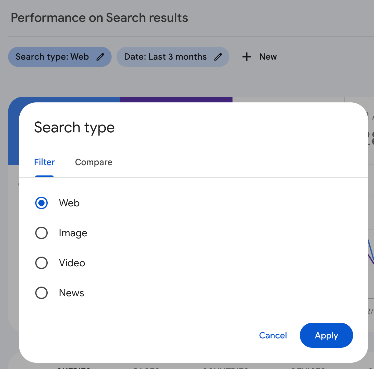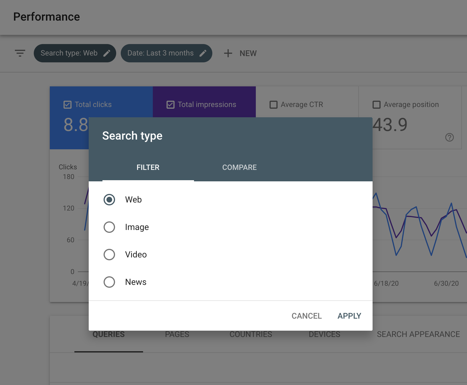
Google Search Console has quietly launched some relatively small user interface changes. It seems like the filters and sorting boxes are now curved and more modern. The buttons look more modern and are a different color and the font sizes are larger.
Here is a screenshot of the new look for those filters overlay boxes:
Here is what it looked like the day before (taken from this story):
Are you noticing any other changes?
Hat tip to Brodie Clark for spotting this just now and posting it on X. He said, “New in Google Search Console: looks like they’ve rolled out a new design for the filter options. I like the cleaner look, but not seeing any new functionality in there. Does this mean we can expect some larger updates in the near future?”
Are you seeing anything else?
Google has yet to document this change, although I am not sure if it is worth documenting.
Forum discussion at X.
The content at the Search Engine Roundtable are the sole opinion of the authors and in no way reflect views of RustyBrick ®, Inc
Copyright © 1994-2024 RustyBrick ®, Inc. Web Development All Rights Reserved.
This work by Search Engine Roundtable is licensed under a Creative Commons Attribution 3.0 United States License. Creative Commons License and YouTube videos under YouTube’s ToS.


